It’s time to get creative!
Brush lettering, crazy colourful quotes and sharing your calligraphy with the world!
Welcome to the last video tutorial in our online calligraphy workshop! It’s time to use your imagination, get creative and follow your own path to new lettering adventures. Download these worksheets and print them (a couple of copies of each won’t hurt!) before you play the video.
1. Cheat sheet for brush pen
2. Brush alphabet sampler
3. Brush alphabet: A – H
4. Brush alphabet: I – O
5. Brush alphabet: P – X
6. Brush alphabet: Y – Z, hello & smile!
7. Wizards & gnomes alphabet practice
Watch the video, pausing and rewatching as often as you like while you practice. Enjoy!
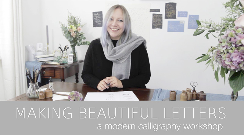
Welcome to tutorial 6 of our modern calligraphy workshop!
I hope you’re really enjoying your new lettering skills. Today we’re adding an exciting new skill to our repertoire – I’ll introduce you to the wonderful world of brush pen lettering.
For the first part of today’s tutorial you will need a brush pen. I use a Tombow dual tip marker – they’re very affordable online (try TombowUSA.com or JacksonsArt.co.uk) but other brands or styles of brush pen will be fine for today if you already have one.
And then it’s time for me to leave you – now pretty amazing at calligraphy, I’m sure! – with some tips and ideas for adding colour and creativity to your work. Don’t miss the list of my favourite suppliers below, and please do try some of the inks and papers I recommend at the bottom of this lesson.
Frequently Asked Questions
1. Which is the best brush pen to use?
Honestly, there are soooo many brush pens to try, and I’ve barely scratched the surface. The Tombow dual tip markers have a flexibility and variety of colour I love. Also try Sakura Koi colours – the range is fabulous and they’re wonderful to write with. When it comes to water brushes, everyone seems to make one – it all comes down to experimenting and finding a pen you love which really suits your own calligraphy style.
2. What do you use brush lettering for?
I address jiffy envelopes with my brush pens. Anything over A4 (US standard letter) size is perfect for a brush pen. Write names in swirling, swooping brush calligraphy and addresses in a simple capital letter style (postal codes HAVE to be legible – never write the post code in calligraphy)
3. Can I use any ink with a water brush?
Pretty much – the only one to avoid is a dark black calligraphy ink, which will stain the brush. Other than that, you should experiment with as many colours as you can find! White ink holds just as well to the brush as colours, and by using different surfaces (rough, textured cards) you can get some lovely effects with your letters. Also try coloured inks, metallic gouache and watercolours.
Brush lettering tips and tricks
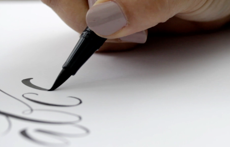
The side of the pen gives a wider line on the page – but do try not to bend the tip if you can! (If you use a jumbo eyeliner pen like me, you’ll know how quickly the end can lose its sharpness – the same applies here!)
Use the very tip of the brush pen, almost at a vertical angle, for fine hairlines including every corner of your lettering!
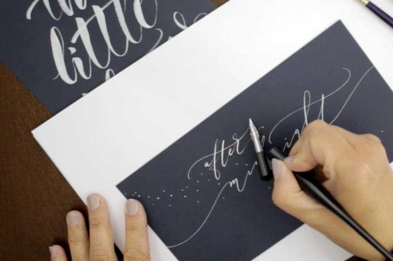
Hidden underneath: White gouache ink on an Aquash Water Brush, on navy blue card from PDA Card & Craft.
Above: white gouache with a Nikko G nib on the same card. The ‘joining’ lines leading off the edge of the card help to centre this piece of calligraphy art.
Supplies, suppliers and recommendations!
I’d like to leave you with plenty of ideas for things to experiment with – so here are some personal recommendations for the pieces of ‘kit’ I have to hand in my calligraphy studio and use most regularly.
Brush pens
I recommend the dual tip Tombow markers for first practices, but once you’re happy with these please do try some alternatives. There are so many brush lettering pens you can buy, and all give a different result. The pens I recommend here are the Pentel Colorbrush and Aquash Water Brush – but they’re available from different brands so shop around!
For real brush lettering, a sable watercolour brush is fun to try. You can also buy signwriters’ lettering brushes, which have a very long, incredibly flexible tip. They’re not easy – but can be a very interesting challenge!
Gold, silver & copper inks
I mix my own inks from gouache paints. The best are by Daler Rowney or Winsor & Newton. Mix the gouache with water until you have a runny ink, and then use it as you would any other ink. It’s lovely on white card or paper… but it really comes into its own on navy blue or black card.
I also love the Finetec palettes – they currently come in golds, pearl colours and special mixed colour sets (fiery tones, rainbow, earth, ocean…). They’re little solid blocks of colour which you add water to with a brush to create a layer of inky liquid on top to write with. A wonderful treat, and pure joy on dark papers! Buy: Europe or US
White inks
The best you can buy is Dr Ph Martins bleedproof white ink. It tends to need diluting (I just transfer a little into a paint palette and add a few drops of water). It works beautifully on dark cards or paper.
Alternatively, you can use a white gouache paint. These work really well – the better the quality of your gouache, the better your finish will be.
I don’t use the kind of white calligraphy inks you find on the high street. They rarely have a decent finish, and look a bit drab on the page. The same goes for metallic inks… avoid!
Coloured inks
You can write with almost anything: water, inks, diluted paints, coffee (yes, I just tried)… if it will flow through your nib and leave a mark, you can do calligraphy with it.
Obviously coffee isn’t the ideal medium, but I hope it explains the scope of what you can play with here! I write with gouache paints all the time: they come in so many colours, can be mixed, watered down and work on light or dark papers.
Watercolour paints are great too: they’re more transparent when they dry which gives a lovely effect – again they mix beautifully and are inexpensive to use.
Papers and card
The surface you’re writing on will have a huge effect on your letters, and I really encourage you to experiment with as many different papers and cards as you can – and in lots and lots of different colours!
Everyday practice papers
I use a good quality laser printer paper – often HP branded, or a supermarket’s own premium paper. Laser paper is exceptionally smooth and your pen will glide quickly across the surface.
Inkjet papers are fine for practice as well, and I often use these for daily work, quotes, experiments etc. They have a slight texture compared to laser paper, which is almost unnoticeable until you begin writing with your calligraphy pen. But once you do, you’ll notice your nib moves more slowly and this changes the shape of your lettering and the rhythm of your writing. If you’re a fast writer, these are really good practice papers.
Gift tags and cards
Uncoated cards are always best – so plain gift tags without any print on the reverse; and simple sheets of card from an online supplier. Experiment with different cards – if you have a Paperchase or Hobbycraft nearby, try as much as you can! Again, most cards have a bit of texture which will slow your calligraphy and give it character. And card is great for taking wet inks – if you’re writing with watercolour or gouache, card will absorb it slowly and beautifully.
Coloured papers and cards
Try everything. There’s nothing more I can say: buy vibrant colours, dark colours (black card and white or metallic ink is amazing), earthy tones… and use contrasting, subtle or soft calligraphy colours to write.
Textured and watercolour papers
Although harder to write on, I really love the texture and finish of watercolour papers. For smoothness (and for beginners) a hot pressed (HP) paper is best; a cold pressed paper will be ok, and a not pressed or rough paper will present more of a challenge! It comes down to the lumps and bumps in your paper – the fewer bumps and loose fibres, the less your pen will catch and skip with every bit of ‘character’ in the surface!
Having said that, I really do adore watercolour papers – they give character. If you’re prepared to experiment then just bear in mind you’ll need to write slowly and watch carefully for every tiny fibre which might become caught in the tines of your nib as you write. Your patience will be rewarded a hundred times over when you complete your first calligraphy quote on watercolour paper!
I use Saunders Waterford and Fabriano papers.
Handmade papers – a word of warning!
Some papers simply aren’t suitable for calligraphy. These include very fibrous handmade papers – the kind you’ll find in craft superstores with petals woven into the paper – or thin Lokta papers. They’re beautiful – but the loose weave and fibrous plant material mean your ink will ‘bleed’ as you write, causing blurry edges to your letters and a blobby finish.
The one handmade paper I have fallen very much in love with is from Silk & Willow. Their handmade 100% recycled cotton rag paper has a wonderful texture. It’s tightly woven, thick and exceptionally strong with a beautiful deckled edge. It’s handmade in India with cotton rag made from recycled t-shirt cuttings – and I recommend you try some as a treat (but don’t be too ambitious with the amount of lettering on there… short & sweet is the way to go!)
Penholders
I don’t like to spend a fortune on expensive penholders – but there are some truly beautiful examples out there so if you can afford to spoil yourself you’ll love some of the artisan penholders by makers like Tom’s Studio, or the incredible Unique Obliques.
For our tutorials I’ve used a Speedball Oblique Penholder. It’s my everyday holder, and works just fine with almost every pointed nib. You could also use a straight penholder – often recommended for left-handers. They’re definitely worth playing with, and most online calligraphy suppliers have a nice selection.
Nibs
There are hundreds of nibs to explore. My favourites for beginners include the Nikko G and Zebra G, Brause rose nib and Blue Pumpkin.
Any pointed nib (a nib designed for Copperplate lettering) will write modern calligraphy scripts. Explore, experiment, treat yourself occasionally and you’ll see they all behave a little differently. Some are really flexible and others relatively rigid, giving thinner hairline strokes and less exaggerated downward swells. The smaller nibs (Gillott 303 / 170) have sharper points and will catch on fibrous papers – but on smooth card they give a lovely, barely-there hairline stroke.
Suppliers – UK & Europe
Blots Pens
Scribblers
PenmanDirect
JacksonsArt
Coliro
Fabriano
PDA Card & Craft (everyday card & paper)
Suppliers – US
John Neal Books
Paper & Ink Arts
Silk & Willow (handmade papers)
Video transcript
Hi again! Welcome to the last tutorial in the series. Today we’re going to get creative with some tips for using your calligraphy – and for making practice more fun. You know the basics, so now all you need to do is keep writing – and really enjoy the art of modern calligraphy.
I really hope you’re falling in love with modern calligraphy, and excited to take it further. I want to show you some tricks to make your lettering more interesting – and I hope you’ll have a go at some of these at home! Let’s start with inks.
I write with black, white, coloured and metallic inks. 90% of the time I use gouache paints – use a paintbrush to mix them with water and paint them onto the underside of your nib. They’re beautiful on coloured papers – try black or navy card with gold or white gouache and you’ll love how amazing your calligraphy looks!
You don’t need to write lines of a, b, c any more. Get creative with your quotes – write about flamingos in flocks of pigeons, unicorns and rainbows and all the other crazy quotes you’ll find online. Pinterest & Instagram are wonderful for inspiration…
Keep framing your work. Get a calligraphy noticeboard and pin your favourite quotes to it regularly. Swap and change as often as you can. Always be inspired, and try to recognise how much your calligraphy has improved since you wrote your first moomin!
Experimenting with other tools can open a whole new world of calligraphy for you. Brush lettering is wonderful – the principle is the same as with a pointed pen, but the technique is just a little different. Write ever so lightly, holding the pen almost vertically, on upstrokes. When you come to move the pen downwards, let the pen fall onto its side while you drag it down the page. This creates super thick swells and amazing contrast with the thinner lines.
Watch how I pause to get the most out of the brush pen. The lighter my upwards and sideways strokes, the longer the tip will last – this one’s a fibre tip, and damages really easily – they don’t cost much, but they don’t last very long either! You’ll know it’s time for a new one when the tip gets a bit squishy, trust me!
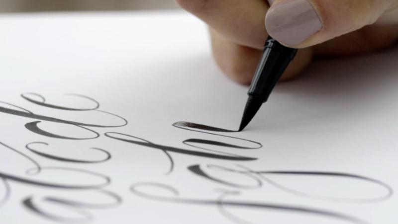
There’s little I can teach you about brush lettering, and by now you know enough about calligraphy to find your own way around a brush pen. I’ve included a couple of worksheets for you to experiment with, but I’d love for you to create your own brush lettering alphabet, using thick and thin strokes
If you really love this style of writing then start with a Tombow dual tip pen, experiment with a Pentel Colorbrush or Waterbrush and even try a standard sable paintbrush. They give very different results and varying levels of control – but they’re so much fun to play with! I use brush lettering for writing on larger envelopes, parcels and gift wrapping. It’s great for really striking framed quotes – and lovely for a really modern look.
Homework:
We’ve come to the end of the modern calligraphy workshop! I hope you’ve enjoyed learning with me and I really hope you continue with your calligraphy adventures. There’s no homework today, just keep loving your practice sessions, write to the people you love, and frame your beautiful letters as often as you can! Thank you so much for joining me.
CREDITS
Claire Gould, by Moon & Tide Calligraphy
byMoonandTide.com
Instagram: @bymoonandtide
Facebook: Facebook.com/bymoonandtide
With huge thanks: these video tutorials were made by Paul Kyte Wedding Photography and wedding photo-films www.paulkytephotography.com
At a glance: skip to another modern calligraphy tutorial in the series:
Tutorial 1 – lines & loops
Tutorial 2 – first letters
Tutorial 3 – lower case alphabets & first words
Tutorial 4 – the beautiful side of capital letters!
Tutorial 5 – curls, curves and common mistakes + the gallery
Tutorial 6 – brush lettering, working in colour + suppliers