Welcome back! I hope you’ve had some time to practice using your calligraphy pen to make smooth loops and swirls, and had some fun contrasting your thick and thin lines.
Today we’re going to use those techniques to write our first letters in modern calligraphy.
Remember to write with a light upstroke, and only press with your pen on the downwards strokes.
Let’s go! Download and print the worksheets, then watch the video, pausing and replaying my demos as you copy and practice your first letters!
Worksheets to download:
1. First letters: n, o, m, i
2. First words: on, no, moo…
3. Guidelines
~ WATCH THE VIDEO TUTORIAL HERE ~
Watch the video, pausing and rewatching as often as you like while you practice. Enjoy!
Frequently Asked Questions
1. My ‘n’ doesn’t look right! Help!
Don’t worry too much… the more you focus on a single letter, the odder it will look! Just concentrate on getting the thick and thin strokes in the right place, and writing at a nice speed to get used to the rhythm of your pen. Once you begin to write words, the letters will look much better in context!
Still struggling? Try writing a huge ‘n’ (about 3 or 4 lines high). Go slowly – this exercise gives you and your pen time to consider where to apply pressure. It’s fine to lift your pen, stop, breathe, and look around even partway through a letter. This can actually help you to refocus.
2. How do I get the thin strokes thin enough?
If you write nice and slowly, giving yourself plenty of time to lift the pressure off the pen as you come around the corner, those upwards strokes should get easier. To help, have another practice of very thin upwards lines from the first tutorial (in the corner of the page you’re writing your ns on). Remind your hand how light those strokes were, and how smooth it feels to write them. Now go back to an n and see if you can make your upwards strokes super light!
Another tip is to pause halfway through a letter and lift your pen from the page. Stop, plan that light upwards stroke and then begin writing again.
3. How do you start / end a letter o?
You can start your letter o from a joining stroke, or from the top. Watch how I write – I never go back over a line I’ve already written. The important thing is that first downwards stroke, which should start thin, gradually swelling in the middle and turning into a very thin stroke before you turn the corner to come back up. To finish an o, just loop at the top and lightly sweep your pen to the side.

A Little Extra Help
The letter n is a natural progression from the lines and curves you’ve already practiced. Write slowly, and be aware of where the thick and thin lines will be.
Often it helps to write a very big n first of all, so you can practice increasing pressure at the right places (and making those super light strokes everywhere else)!

With each new letter you learn, practice writing short words by joining the letters together
on, no, moo, moon and moomin are great practice words for today. Perfect your letters, then consider the joining strokes. If you can join letters with a really stretchy, long joining stroke then you’re way ahead of the game. Well done!!!
Next time…
We’ll be writing a full alphabet, with worksheets to help you master all of the lower case letters. Happy practising!
Video transcript
So last time we were discovering our new crazy shaped pens, making lines and shapes and getting inky for the first time – and I deliberately skipped a few of the more boring tips about writing calligraphy… which I’m going to go back to now and explain for you.
It’s really important to maintain good posture while you write, especially if you’re going to be spending a lot of time on calligraphy. An afternoon writing place name cards can be tough on your wrist, back or neck – so watch your posture.
Position your paper away from the edge of the table so your wrist isn’t resting on the corner of the desk. Don’t be tempted to let your paper creep back towards you!
Your nib should be pointing towards one o’clock on the paper. Depending how you normally hold a pen, this can feel strange. Rather than contorting your wrist, turn your paper around.
Your nib should be fairly low to the paper – by this I mean don’t hold it too high or too low. Imagine an apple under one end… this will cure any scratchy noises you make as you write, which are often caused by too high a pen angle. Try not to rub your nose on the paper as you write (I do!) and take a breather every few minutes.
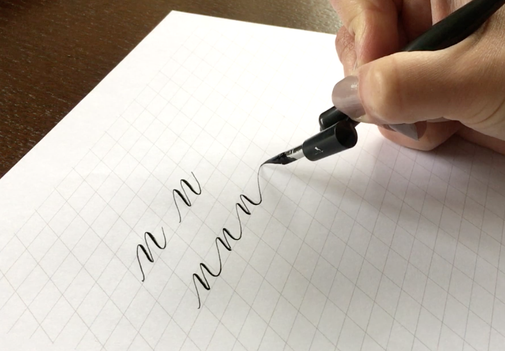
Now let’s do something more interesting! We’ve mastered the thick and thin strokes of the pen, so let’s start turning this technique to actual letters. Every letter is built from thin and thick strokes. The letter n for example has a thin stroke up, a thick stroke down, a thin stroke up and a thick stroke down. And then a final thin joining stroke up to the next letter – like this.
The letter o starts with a thin stroke up, leave the paper, and from slightly higher up begin a gradually thickening stroke down. Start this one really light, add pressure and remember to exert no pressure on the pen as you turn around the corner to come back up. It’s really helpful to try your first couple of letters quite big at first, to understand when and how the pressure works.
Write a line of each letter n and o, and then try joining them. Try a letter m, which is the same as an n but you just keep going a little longer… and then join this to your repertoire! Let’s add an i as well… it’s a simple letter to learn.
We can now write a few simple words – on, no, in, moon. As you join the letters and practice the letter shapes, don’t forget the joining strokes. Think of these as your washing line… you’re ‘hanging’ your letters on the line to dry – and that line is important! It’s what gives a lot of character to modern calligraphy lettering. Stretch it a little… play with the line. I have a favourite exercise which I do in my Manchester workshops: can you write ‘moon’ so it fills the entire width of the page, but keep the letters tiny and the joining strokes really long? Try another word: see how far you can stretch a moomin!
Until next time, it’s worth having a few practice sessions with your moons and moomins to perfect those shapes. Practice writing your first letters with the thick and thin strokes in all the right places, and lovely long joining lines between.
Join me on Instagram or Facebook for new calligraphy inspiration and ideas, special offers and calligraphy tips! I’m @bymoonandtide on Instagram and Facebook.com/byMoonAndTide
Claire xx
CREDITS
Claire Gould, by Moon & Tide Calligraphy
byMoonandTide.com
Instagram: @bymoonandtide
Facebook: Facebook.com/bymoonandtide
With huge thanks: these video tutorials were made by Paul Kyte Wedding Photography and wedding photo-films www.paulkytephotography.com
At a glance: skip to another modern calligraphy tutorial in the series:
Tutorial 1 – lines & loops
Tutorial 2 – first letters
Tutorial 3 – lower case alphabets & first words
Tutorial 4 – the beautiful side of capital letters!
Tutorial 5 – curls, curves and common mistakes + the gallery
Tutorial 6 – brush lettering, working in colour + suppliers