Curls, curves and common mistakes
Today we’re experimenting with different calligraphy styles, strokes and more – and solving problems with blobs, scratches and ink flow.
Download these worksheets and print them (a couple of copies of each won’t hurt!) before you play the video.
1. But first, coffee
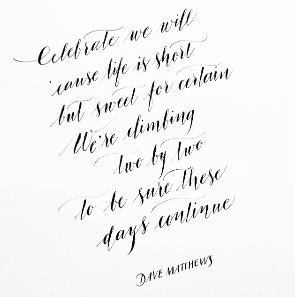
2. Celebrate
Watch the video, pausing and rewatching as often as you like while you practice. Enjoy!
Hi! Welcome to the fifth tutorial of our online calligraphy workshop. I really hope you’re enjoying it – and if you’ve had a chance to practice any capital letters, names etc that is fantastic. I’d love to see! If you’d like to tag me on Instagram I’m @byMoonandTide 🙂
Today we’ll have a look at quotes, layouts and those fabulous curving joining strokes which make all the difference in modern calligraphy. It’s time to get creative and I’ve written a selection of quotes to inspire you – there are some to download, and more images below for you to copy. Look closely at those layouts, especially seeing how I’ve filled any gaps – and have a play with your own favourite quotes too!
Afterwards, we’ll look at some common mistakes with calligraphy which might be holding you back – pen angles, speed etc. If you do have any questions, or anything you’d like to ask which isn’t covered here, please do get in touch: the best way is via email – calligrapherclaire@gmail.com
I’ll add any queries to the FAQ section below!
* * don’t miss the note about buying a BRUSH PEN for next time – more info at the end of the page * *
Frequently Asked Questions
1. Where can I find inspiration for quotes to practice?
There are so many places you can find quotes. Song titles are perfect (anything from Bring me Sunshine to Sky Full of Stars). Listening to music while you write can be an endless and enjoyable source of inspiration for your lettering! Or try searching for quotes on Pinterest, or browsing Instagram for the hashtag #qotd.
2. How can I make more of a feature of my joining strokes?
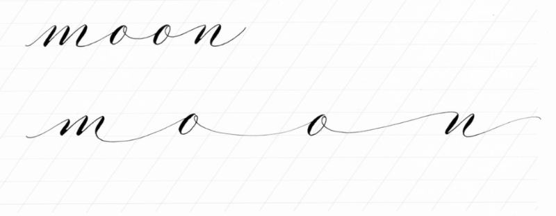
To really accentuate those joining strokes, try writing words with small letters and big joins. Imagine each joining stroke should be five or six times as wide as each letter. Remember in Tutorial 2, at the end I asked you if you could stretch a moomin? Have another go, writing the letters small and the joining strokes long… like this:
m……..o……..o……..m……..i……..n
The worksheet from Tutorial 2 has a calligraphy example with the word moon. Print it again, practice, then see if you can write more words like this. Try ‘hello’ and ‘love’.
3. I can’t point my pen towards one o’clock – does it matter?
The reason I say to point your pen in this direction on the paper is so the nib writes and wears evenly. Think of the nib as an arrow: it points in the direction it wants to go.
If you point your nib in the opposite direction – towards 10 o’clock – you’ll be dragging it sideways and creating jagged lines when you try to put pressure on a downwards stroke. One half of the nib will overlap another, and it just won’t write smoothly. You should turn your paper if it helps; and really concentrate on correcting your pen angle as you write. If you’re really having problems you could also try a straight penholder – sometimes it fixes pen angle problems. (US supplier)
If you’re pointing your nib towards 12 o’clock at this stage, it’s fine. So long as your lettering feels smooth and your nib is gliding across the paper without catching or making scratching sounds, there’s nothing to worry about.
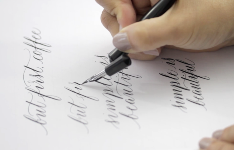
Writing quotes is a lovely way to practice letters and experiment with different calligraphy styles. Squishing letters together and using more pressure gives a bold, modern style; stretching joining strokes and keeping letters small creates a more edgy, organic calligraphy style.
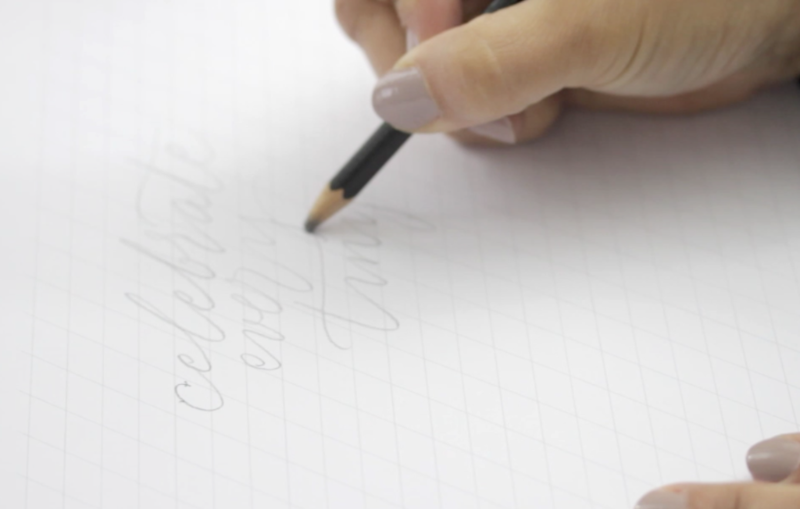
Plan your quotes in pencil first, or use an everyday pen and a piece of scrap paper to help visualise where letters might clash or leave gaps you’ll need to fill.
Be proud of your work!
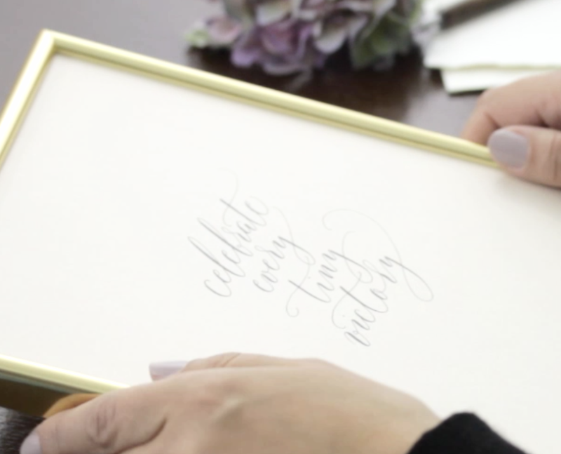
Write something small in the middle of a sheet of paper, then frame it in an oversize frame. Your calligraphy should make you smile!
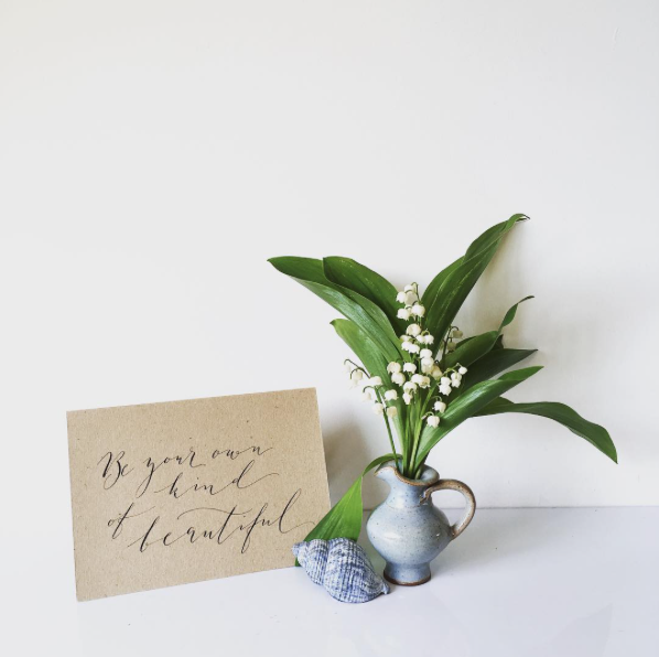
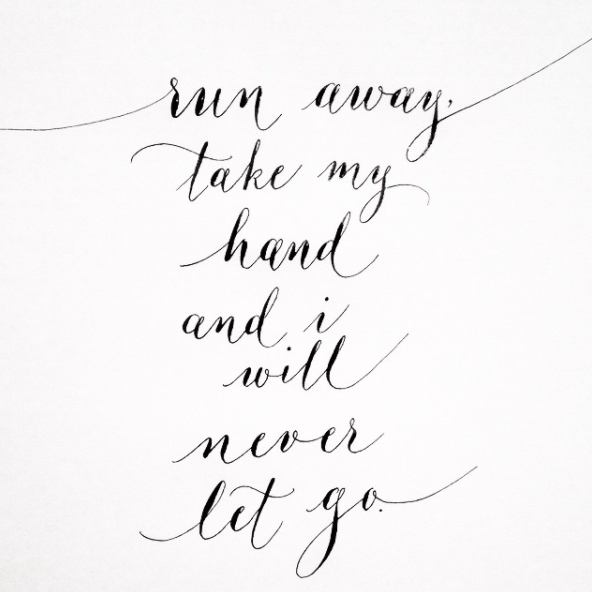
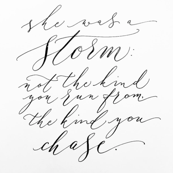
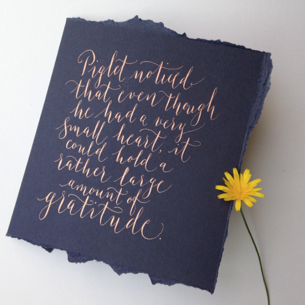
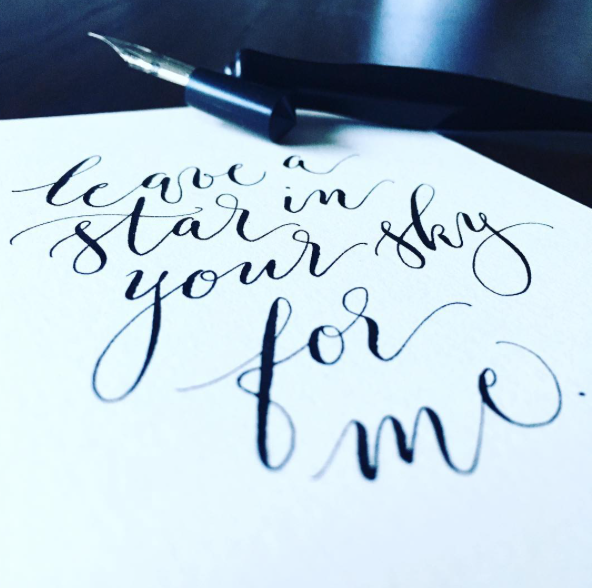
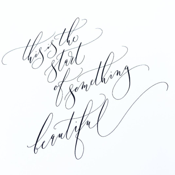
The gallery!
View, print, and copy these examples of quotes and calligraphy layouts!


Next time…
We’re going to look at brush pen lettering. If you don’t already have one, it’s time to buy a brush pen (they are really affordable – about $3 in the US or £3 in the UK.) They come in a huge variety of colours so choose any, or buy a couple! Other brands or styles of brush pen will be fine if you already have one.
Tutorial 6 also has notes on colour, including a comprehensive list of inks to experiment with, and suggestions for creative projects to continue your calligraphy adventures!
Video transcript
So far we’ve been learning letter by letter – which is fine for writing gift tags, place names and the like. But the secret of modern calligraphy is the flow – and that takes a different kind of focus. Today let’s forget letters, and consider words as a whole.
The loveliest lettering is smooth, curvy and full of character. There’s a pattern to the words and a playfulness too. They’re fun to write! Remember stretching a moomin? Let’s try again.
This time, concentrate on the pattern of your joining strokes. Different stroke lengths will give you different styles of calligraphy – a compact, quirky style with shorter joins, or a loose, organic lettering with longer strokes. When you’re done, look closely at the letters. There should be no corners, only smooth curves. The joins should be roughly the same length and letters roughly the same size.
Play with placing letters above and below the lines as you write – it adds playfulness to your writing. When you’re writing quotes or song lyrics, this really helps to ‘fit’ each line of writing to the one above it. Try to fill every gap – but plan ahead to avoid descending strokes.
Stretching your letters, washing line and changing pen pressure is the key to different calligraphy styles. Write the same quote with a light touch and long gaps – and then with heavier strokes and shorter gaps. See how different it looks? You can vary the slant of your letters too. Try it!
There are some tricks you can use when you first start writing quotes – sketching out the layout in pencil is really useful – or even writing a first draft in ink and then tracing it until you’re happy with the final version. I’d love for you to write something today, just a little postcard size quote, and then frame it – leave a huge margin and hang it somewhere to inspire you. Be proud of what you’ve learned!
Now let’s take a look at some common mistakes.
To really perfect your calligraphy you need to go back to the very basics every now and then. Those thin strokes we learned in the first tutorial are really important – and worth practising in every session. Always check your letters have a balance of thick and thin – and for a bold style remember to vary the thick and thin as much as you possibly can!
The most common mistakes for beginners are pen angle, writing speed, and letter size and shape. If you find yourself doing any of these, be aware of it and try to correct yourself as you write.
Your pen wants to point to one o’clock, or at least twelve, to write at its best. This is because of the way the tines of the nib (the end bits) split as you write. Dragging them sideways will create scratchy noises, and jagged strokes. Rather than bending your wrist, turn your paper so your hand points to 1 o’clock on the page. Remember the apple underneath your pen? Holding your pen too high causes scratching and unevenness too. This is the perfect angle for writing.
Don’t rush your lettering practice. Lift your pen from the page after every couple of letters – look, reassess, plan ahead to the next bit. It’s not a race! For elegant lettering, think eggs rather than footballs (that’s soccer balls, if you’re in the US! Your footballs are actually quite a nice calligraphic shape!) – round letters should be narrow, so practice squashing them a little… words should look like well-spaced eggs on a washing line!
Claire xx
CREDITS
Claire Gould, by Moon & Tide Calligraphy
byMoonandTide.com
Instagram: @bymoonandtide
Facebook: Facebook.com/bymoonandtide
With huge thanks: these video tutorials were made by Paul Kyte Wedding Photography and wedding photo-films www.paulkytephotography.com
At a glance: skip to another modern calligraphy tutorial in the series:
Tutorial 1 – lines & loops
Tutorial 2 – first letters
Tutorial 3 – lower case alphabets & first words
Tutorial 4 – the beautiful side of capital letters!
Tutorial 5 – curls, curves and common mistakes + the gallery
Tutorial 6 – brush lettering, working in colour + suppliers