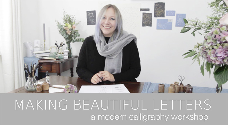
The beautiful side of capital letters!
Welcome to your 4th calligraphy tutorial! I hope you really enjoy this week – I honestly love capital letters! Sometimes students are quite nervous to try them, but I think you’ll find they’re much more interesting to write. Try S and F… they’re my favourites!
Capitals also give you scope to use lovely thick downwards pressure, so write them slowly at first, and learn to love them!
Download and print the worksheets, and then play, pause and replay the tutorial as often as you need to.
1. Cheat sheet alphabets (this is the same worksheet as in Tutorial 3)
2. Capitals: A – M
3. Capitals: N – Z
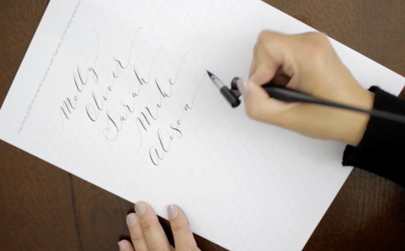
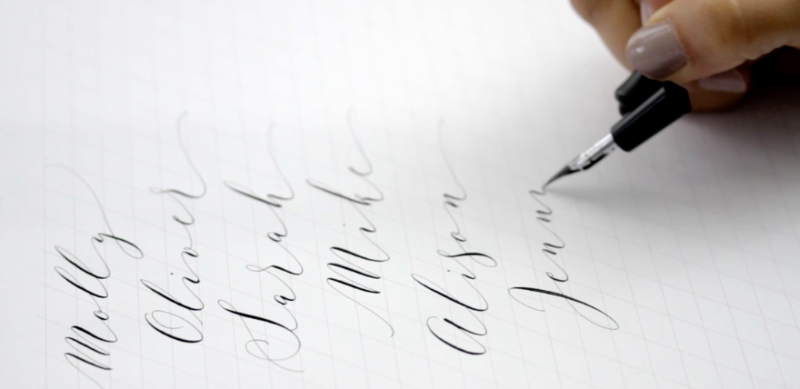
4. Names
5. Cities
6. Gridlines
Watch the video, pausing and rewatching as often as you like while you practice. Enjoy!
Frequently Asked Questions
1. Which bit of a capital letter do I write first? Where do I start?
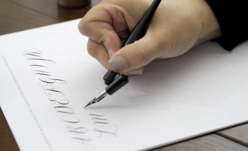
If a capital letter has a line down the middle (e.g. T) start with that line. You can form the rest of the letter around it. Watch how I write F, T and K. For most letters I tend to start at the far left, with a thin upwards stroke to begin. If you’re not sure about a particular letter, skip to the relevant part of the demo and watch how I’ve done it.
2. Do capital letters join onto the next letter?
This is an interesting question: sometimes I join them, but often it’s hard to do. A letter J would naturally join with the following letter (and Jo is my new favourite name to write!) but letters like F, D… in fact most capitals – don’t need to join to the next letter in your word. Instead of joining them, think carefully about the gap after them, and plan exactly where your next letter will go. You’ll soon develop an instinct for the size of the gap between letters, don’t worry!
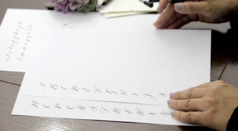
The alphabet practice sheets are similar to the lower case practice sheets we used last time. Print a couple of these, and aim for 3 perfectly matching letters at the end of each row!
I demo the alphabet once in the video, but you should stop and replay each letter as many times as you need to.
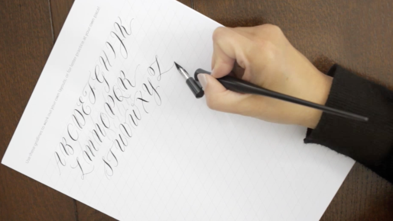
When you’re done with alphabet drills, move onto more interesting exercises – I’ve included example worksheets for you to copy which have place names and people’s names. Use the guidelines worksheet to keep your letters slanting at the same angle and your words straight on the page.

Writing in a completely different style isn’t as hard as it looks. Shrink your letters to half the size, and extend your joining strokes so the gaps between the letters are huge! Again, there’s a worksheet to copy, but I’d love for you to practice this with your own words or names!
You could even trace these two worksheets for practice if you need a little extra help: photocopy them at a very light setting so you can only just see the letters and flourishes, and write slowly over them. Instant cheat sheet!
Try writing words of your own too – names, places, rivers, planets, months… anything with a capital letter.
Next time…
Letter practice is more fun with quotes than endlessly repeating the same letter. I’ll demonstrate how to plan the layout for a calligraphy quote, and share my gallery of examples for you to copy, trace or study!
We’ll also go over some common mistakes to perfect your calligraphy writing – so if you’ve any worries about your lettering, Tutorial 5 is there to help!
Video transcript
Hi! I know you’re itching to tackle some more intricate letter shapes so today we’re going to write capital letters. Print out the alphabet template which goes with this tutorial, watch at first as I write the letters and then work your way through again, letter by letter, copying my strokes.
Some of the capital letters can look really tricky but in every workshop I teach, students surprise themselves by falling in love with a letter they never thought they could write!….
… So I’ve rewritten the alphabet to start with a capital F for you. Watch the demo, then have a go yourself!
There are a few tricks to writing capital letters. Write them as large as you can at first, so you give yourself time to see where the thick and thin strokes go. For letters with a straight downwards stroke in the middle, I find it’s easiest to write this first.
On the F and T, the horizontal strokes need to be as light as they possibly can because your nib will be making a long stroke against its natural direction. You can really play with pressure on capital letters – this is where you’ll make most impact with your calligraphy so remember: bend the nib as far as you can on the downwards strokes to get a really thick line and it will look amazing!
Practice writing words with capital letters. Play with names – so you could list your family – or write out clusters of cities, countries, rivers or favourite places. Or write in German, where they use a capital letter for every single noun!
To develop your lettering further, you can begin to add a few flourishes here and there, and play more with the spacing of your letters. I like to add a swirl at the end of a name… with place cards, extending a fine hairline to the left and right of a name is a lovely little touch. And varying the pressure you apply, the direction your letters lean, and the spacing between them makes for very different calligraphy styles.
I’ve written a few templates especially for this workshop so have a look, and see if you can vary your lettering to create similar styles.
Homework – at this stage I’m afraid it all comes down to practice, practice and then practice a little more! Keep writing those rivers and names until the shape and flow of your lettering comes naturally.
Join me on Instagram or Facebook for new calligraphy inspiration and ideas, special offers and calligraphy tips! I’m @bymoonandtide on Instagram and Facebook.com/byMoonAndTide
Claire xx
CREDITS
Claire Gould, by Moon & Tide Calligraphy
byMoonandTide.com
Instagram: @bymoonandtide
Facebook: Facebook.com/bymoonandtide
With huge thanks: these video tutorials were made by Paul Kyte Wedding Photography and wedding photo-films www.paulkytephotography.com
At a glance: skip to another modern calligraphy tutorial in the series:
Tutorial 1 – lines & loops
Tutorial 2 – first letters
Tutorial 3 – lower case alphabets & first words
Tutorial 4 – the beautiful side of capital letters!
Tutorial 5 – curls, curves and common mistakes + the gallery
Tutorial 6 – brush lettering, working in colour + suppliers